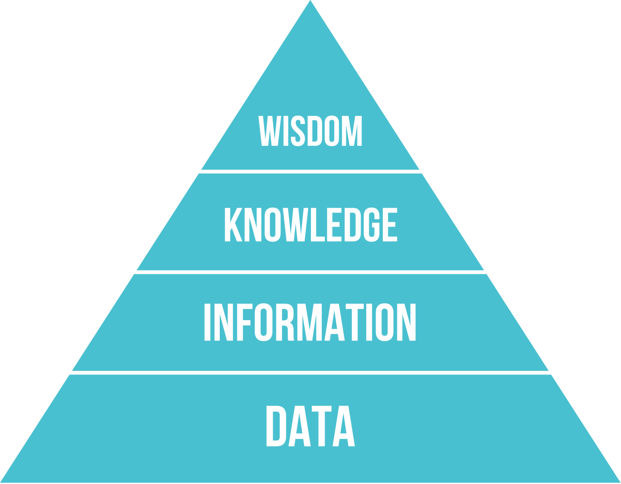
Based on some recent conversations with users at our partner sites, I got to thinking about the return on investment, or ROI, of data usability. Data is delivered in a variety of ways: via a spreadsheet, in a dashboard on a website, in a static chart in an email, and so on. However, the interpretability and accessibility of data is increasingly paramount as organizations look to empower end users with answers that can drive revenue-impacting change.
To help set the stage, I asked everyone’s newest digital sidekick, ChatGPT, to come up with a relevant parable:
Once upon a time in a faraway kingdom, a humble villager received a magnificent treasure as a reward for his kindness. The intricate golden box, encrusted with sparkling gems, promised to grant him endless riches. Eager to unlock its mysteries, the villager spent countless days and nights attempting to decipher the box's perplexing mechanisms. Alas, the treasure's complexity was too great, and the villager remained confounded. As time passed, the once-coveted gift turned into a symbol of frustration collecting dust on the shelf. It served as a constant reminder that even the most valuable treasure becomes worthless if it cannot be understood and enjoyed.
Ascending the Data-to-Wisdom Pyramid
Health systems are sitting on mountains of raw data. Reconstructing the context around the clinician experience and patient journeys is a critical task for health system analytics teams. In my focus area, the need stems from quality, informatics, and other operational teams that need to assemble data-based stories to evaluate the effectiveness, potential harm, and other impacts of their efforts.
Importantly, the demand for data is off the charts when contrasted with the number of available analysts to painstakingly fetch it. I’ve been told of turnaround times that are weeks to months long, even years to get a data request fulfilled. (I’ve discussed elsewhere the costs that pile up every day as a result of these delays.) Given the technical complexity in querying an extensive database and ensuring the query is clinically sound, just getting the appropriate raw data organized is a challenge. Then what? In a sense, this marks step one in the data-usability journey.
In my opinion, delivering “a report” of raw data is a poor data-usability experience for the end user. While it enables the overwhelmed analytics team to close the request ticket and move on, it shifts the responsibility for synthesizing the data to the end user. Sure, some end users will be able to run with those results, but others will not be able to do it easily or will require further help. In essence, data usability boils down to moving data along the data-to-wisdom pyramid (I’ve referred to this sometimes as the data-to-change pyramid). But who bears this responsibility: the analytics team or the end user?
As health systems work to support end users, there has been a significant rise in the use of self-service dashboards to try to address these problems. They synthesize raw data for a higher level of understanding while reducing the lag time in delivering answers to end-user questions. This has augmented the end-user experience away from raw “data”, but my conversations with end users tell a more complicated data-usability story.
Are All Self-Service Analytics Dashboards Created Equal?
As I mentioned at the outset, the feedback from Phrase Health’s end users made me think about data usability in the context of self-service analytics dashboards. The reason being that every single one of our fully capable health system partners has access to their own homegrown business intelligence tools (e.g. Tableau, Qlik, Power BI, etc). They also have access to their robust native electronic health record (EHR) system tools (e.g. SlicerDicer, Lights On). Yet they still become Phrase Health customers.
There is an ROI story to data usability here because we see broad adoption of Phrase Health engagement across informatics, quality, and other operational changemakers even though they are aware that the data in our software can readily be pulled elsewhere. Are all self-service dashboards delivering the same information, knowledge, and/or wisdom even if they all access the same data?
Per a recent email from a quality-team user at a partner site:
Thanks for reaching out. I am happy to tell you all about how much I love Phrase Health!!
My role is to support clinical operations from a quality and [EHR] perspective, so I project manage our quality improvement initiatives. I also liaise with the ED [EHR] team to make changes to improve workflows/documentation.
I use Phrase Health all the time. I recently pulled reports on orderset utilization to see how often my ED RNs were using the sepsis order set that they have available to them.
I pull reports of alert encounters frequently to see if the alerts are doing what we want them to do. We created an alert for patients at risk for sepsis and when I recently used Phrase Health, discovered a large proportion of RNs were dismissing the [alert]. I think the breakdown on response to the [alert] is probably one of the most valuable insights your product provides. It made me realize that this particular alert was being rendered useless if the RN could dismiss it (we needed to force the RNs to choose an action), so now the [EHR] team is making that change for us.
I used Phrase Heath a couple weeks ago to answer a question for my VP about our trend in the number of patients at risk for sex trafficking. We have an alert in place for high-risk patients, but have nothing else discrete in [the EHR] that could capture that population, so I knew I could go to Phrase Health to get the numbers over time.
As far as I’m concerned, Phrase Health is invaluable to a quality manager like myself who’s actively involved in trying to improve the intersection of informatics and clinical care.
I can’t think of anything I need that it doesn’t currently provide, but I’ll definitely think on that as I continue to use the product.
I love Phrase Health and am happy to tell anyone who will listen how much I love it!
And another email from a technically advanced CMIO at a partner site following their Phrase Health implementation:
Subject: It took all of 21 hours until.....
….Phrase analytics added value to [our organization].
Seriously just finished our working group for Colorectal Cancer Screening. Using the Phrase Health tool we were able to dig in and find “challenging” areas and people to have “chats” with.
And then got 2 emails saying “can I get access please?”
This is going to be great fun. Thank you.
Marc’s Rules of Thumb for Augmenting Self-Service Analytics
Here are some generalizations based on my personal experience. Of course, this is purely observational and highly opinionated, so I appreciate any perspectives from others.
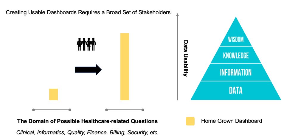
Rule 1: Creating usable dashboards requires a broad set of stakeholders:
Unless thoughtfully designed alongside relevant domain experts and end users, a custom dashboard will invariably abandon end users at the “information” stage. The end user will likely need to be an expert themselves (or engage the experts) when trying to translate the data presentation into actionable insight. Therefore, dashboard developers should always work very closely with domain experts and end users in order to help move the data beyond “information” by incorporating synthesized and relevant insights.
 Rule 1
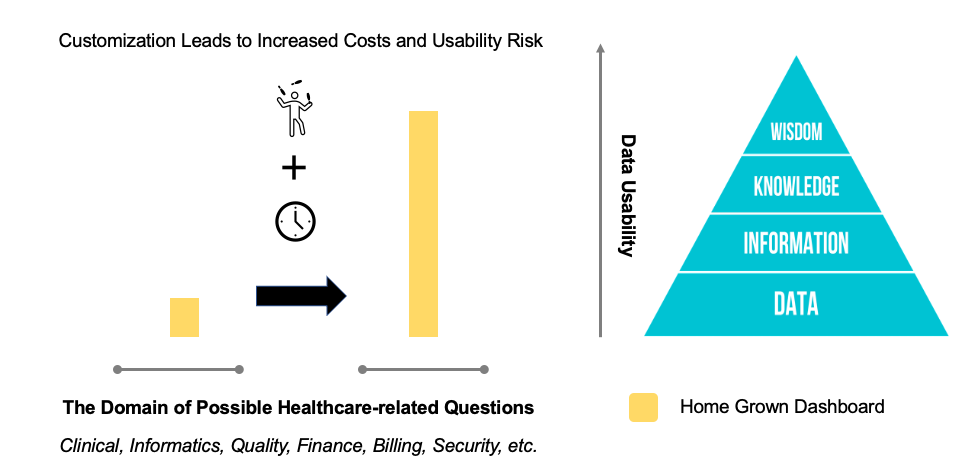
Rule 2: Less customization leads to lower costs and usability risk:
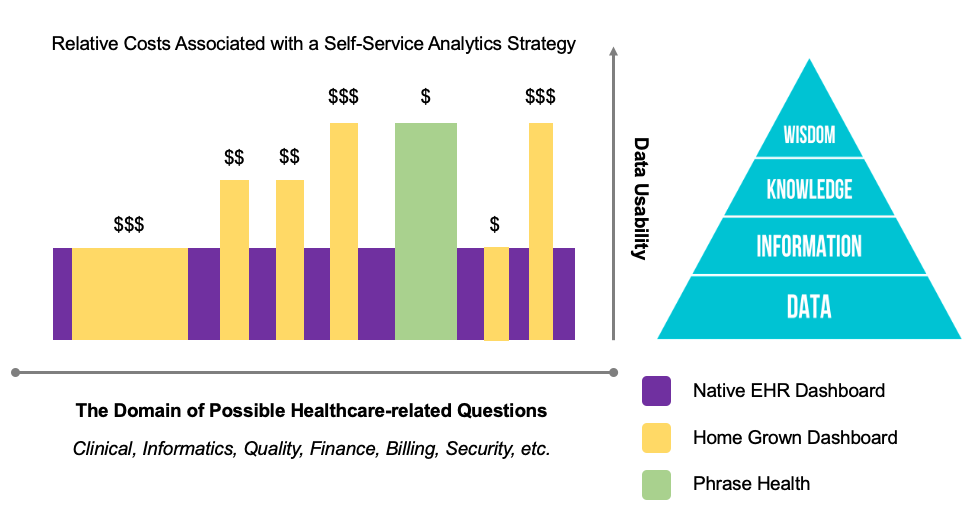
Customizability has significant power, but it comes at significant cost (mainly time investments) and interpretability risk to the end user. Custom dashboards can take hundreds of hours to build and create incremental drag on IT teams given that they have to be maintained continuously over time. This serves as the principal supply constraint on rolling out highly usable custom dashboards for every possible end-user question. Additionally, many organizations struggle to maintain a universal design layout for these dashboards, which introduces traditional usability challenges as end users adapt to different layouts to grab data from different dashboards created by different developers. The costs and usability challenges of developing robust custom dashboards leaves many limited to the “information” stage.
 Rule 2
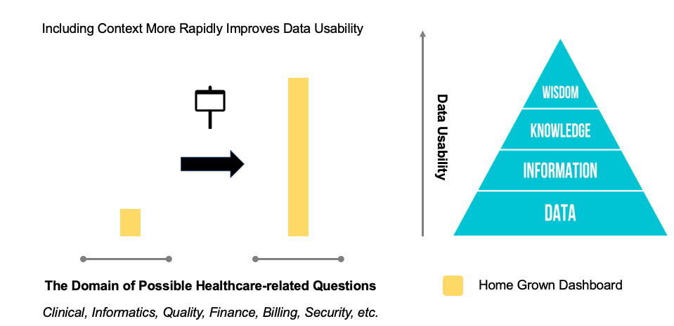
Rule 3: Including context more rapidly improves data usability:
Viewing data presented in isolation is very different from viewing data that includes demonstration of how it fits into the larger picture. This is best illustrated with an example. Consider a self-service analytics dashboard for EHR alerts that allows the end user to dive into an individual alert for granular analysis. The list of alerts may have similar sounding names like one called “Initial Sepsis Alert” and another called “Nursing Sepsis Alert”. Is the end user looking at the right alert? Perhaps, the analytics dashboard isn’t showing a certain action being taken because the alert doesn’t allow it. To better interpret the data and deliver better data usability, knowing the context (e.g., a picture of the alert) is imperative.
 Rule 3
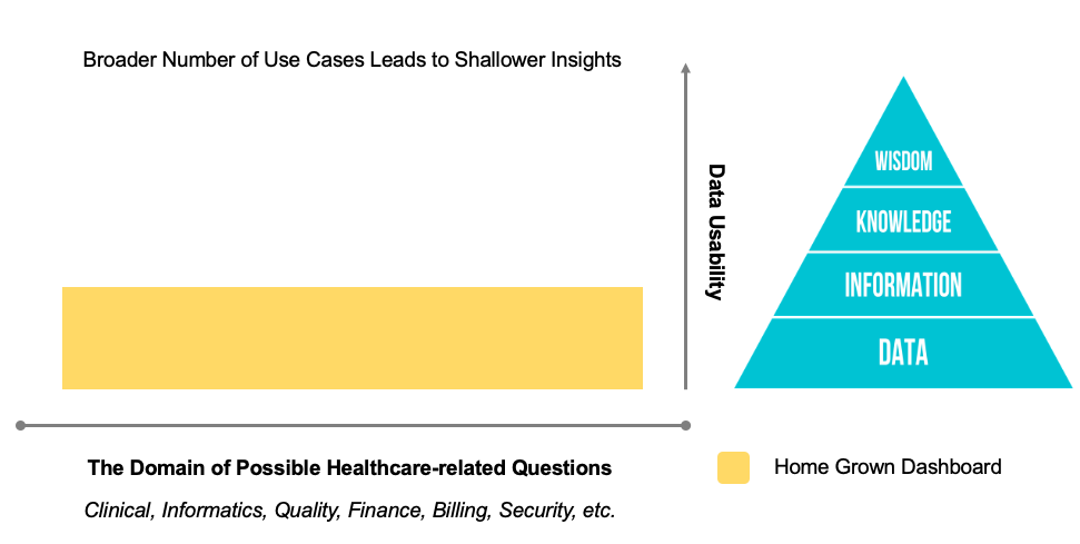
Rule 4: Addressing a broader number of use cases leads to shallower insights:
The broader the set of use cases addressed by a self-service dashboard, the shallower the insights delivered to a typical end user will be. In other words, it is very difficult for an end user to acquire “knowledge” or “wisdom” from a dashboard that tries to answer every possible question across completely different subjects. Given the extraordinary breadth of potential questions in healthcare, any insightful data transformations that could improve data usability will invariably be hidden behind menus, filters, modals, and tabs that will leave a typical end user stuck in the “information” stage.
 Rule 4
Usable Data Means Quicker Results and Happy Staff
Phrase Health technology was developed by clinicians, informaticists, and quality improvement specialists over the course of almost a decade. It focuses on answering questions pertaining to EHR workflows and their impacts on downstream patient outcomes that clearly drive ROI. In this way, it can provide deep insights, often based on research-validated approaches, into perspectives on things like malfunctions and actionable steps that can reduce clinical variation and improve clinician efficiency. Beyond analytics, the narrow focus enables contextual support via functionality that helps our users tag, review, and organize their EHR workflow content. Additionally, the technology displays what clinical decision support (CDS) interventions look like right alongside their performance for further context.
I believe the end-user feedback reflects (1) an iterative evolution of a self-service platform curated by domain experts and end users that (2) has a uniform interface, (3) contextualizes the insights with governance and design information, and (4) is focused on a narrow set of use cases.
 Relative Cost Summary of a Self-Service Analytics Strategy
Bringing It Together
A robust self-service analytics strategy is imperative for health system leadership that aims to maximize their data ROI. The goal is to empower as many end users as possible with the most coverage of potential questions, with the most data usability, and at the lowest cost. Not only does Phrase Health get rave reviews for data usability, but it does so with an affordable approach that also allows analytics resources to dedicate their scarce availability to alternative data-usability challenges.
Don’t let your end users and changemakers think of your valuable data as a “symbol of frustration collecting dust on the shelf.” Reach out to me to learn more!
Check out more content
Next: Linking Clinical Decision Support Tools to Clinical Outcome Opportunities
Previous: Common Challenges as Described by Actual Providers


